Copyright 2020 by Gary L. Pullman
In Part 1 of “The Thrill of It All,” we analyzed some of the design techniques that movie
posters for thrillers use to attract audiences. The
techniques that we identified are:
- Make sure that your protagonist stands out from other characters.
- For as long as possible, merely suggest the menace that your main character faces.
- For as long as possible, withhold context: do not explain the cause of the protagonist's dilemma until the end of the story; this ploy keeps your readers guessing and maintains suspense.
- In dialogue or the protagonist's own thoughts, pose a rhetorical question or two (but not too many at once) to introduce or heighten suspense by hunting at the problems your protagonist faces or may face in the future.
- Deliver on the implied promises your use of each of these techniques creates in the minds of your readers.
In
Part 2 of this series, we will examine how thriller movie posters use
color to appeal to the interests of thriller movie audiences.
Black
and dark colors, such as browns, may have symbolic significance that
viewers and readers “read” on an a subconscious level, based on
associations with such colors that are transmitted culturally,
through the arts in general. Black, for example, is often linked to
the unknown, to evil, and to death. Like dark colors, black also
obscures vision, rendering characters “blind” and reducing them
to helplessness. For these reasons, black and dark colors, in
general, have taken on an ominous quality. When describing scenes,
refer to black and dark colors to create a sense of menace or to
obscure your protagonist's sense of sight, as the poster for Thriller
(2018) does.

White
and light or bright colors, such as yellow and orange, can illuminate
darkness, for a few inches or feet, at least, allowing a character to
see that which is obscured; at the same time, white or light colors
can illuminate the protagonist's face, highlighting him or her,
which, of course, can make the main character vulnerable, allowing
the villain to locate or attack him or her, so such colors =can both
benefit and endanger the main character.

Monochromatic
color use can emphasize a protagonist while, at the same time,
immersing him or her in the environment, since his or her
surroundings are the of a hue that is lighter or darker than the hue
in which the protagonist is shown. This technique is used with good
effect in the poster for Gothika (2003).
Although
this technique might not be used often in novels or other written
forms of fiction, it can be the basis of a pertinent descriptive
passage when it is warranted. For example, a girl in a green dress
may awaken in a pasture, a boy dressed in blue may walk alongside a
swimming pool the water in which is reflective of a blue sky, or a
man or a woman in red may enter a red room. Usually, such scenes
would be reserved for significant, stand-alone scenes or short
stories. Edgar Allan Poe uses this technique to great effect in his
masterful short story “The Masque of the Red Death” (1842).

The
Regression (2016) poster combines the use of black and gray
with the use of red. The latter color appears only in one place in
the poster's image, in the form of a fiery inverted cross that burns
along the junctures of a barn's hayloft doors. (The color also
appears once in the text at the bottom of the poster, advising
viewers that the picture will play in theaters in December.) An
inverted cross represents evil, since it literally turns the
Christian sign of Jesus's sacrificial death upside-down. (In occult
lore, an inverted sign supposedly cancels out the power represented
by the sign). The fact that the cross is afire also suggests its
destruction, but this image may also imply the passion with which
this destruction occurs—the passion, in other words, of the unseen
foe.
On
the literal level, the black and gray represent night; symbolically,
they might also suggest evil. The judicious use of color can
accomplish as much in a novel's description as it does in the imagery
used in the Regression poster.

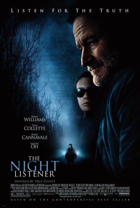
The
poster for The Night Listener
(2006) uses black, white, and blue to guide the viewer's eye downward
and to the right. The left side of the poster shows a a line of dark
trees in silhouette. The right side of the poster shows a large image
of Ganriel Noone (Robin Williams) and Donna Logand (Toni Colletee)
standing side by side. The treeline on the left and the couple on the
right frame the white and blue colors which, together, form hazy
light, perhaps the result of a full moon shining through fog.
The
wedge-shaped light funnels the viewer's vision down and to the right,
past Noone and Logand, to a much smaller image of Noone, standing
alone in the middle of what looks like a forest trail or road. Bright
white light appears at his sides and begind him. Although the source
of the light is unseen, its placement seems to suggest that the
illumination radiates from Noone himself. Deliberate placement of
objects and color can create symbolic effects like the ones in this
poster.
As
we have seen, color, as it is used in movie posters, often has a
symbolic significance. In the movie poster for the thriller Bardo
Blues (2019),
blue is the primary color. The face of the protagonist, Jack, a
mentally ill young man (Stephen McClintik), is shown amid an inkblot
formed by dark purple against a variety of blue tones that create a
shimmering effect.
The
title of the film, Bardo Blues,
references depression (colloquially known as “the blues”),
suggesting that the man depicted on the poster suffers from clinical
is depression. The inkblot shape implies that he is mentally ill,
since inkblots were once commonly used in the controversial Rorschach
test designed to uncover thought disorder. The shimmering effect of
the blue tones that form the poster's background suggest confusion or
instability, complementing the inklblot shape's suggestion that the
protagonist is in some way mentally unstable.

Colors
are used in many other ways, for a variety of additional purposes.
Study other posters' uses of color to discover how you can use
color in your own writing to achieve similar effects as those that the posters
employ.
A
couple of caveats are in order, before this post concludes.
First,
the posters are ads, not stories. As such, they are designed to sell
the products, the films they promote, not to present a drama that
enacts a well-plotted story. Therefore, posters often do not
correspond to the dramas they promote or have only a slight
correspondence to the films' plots.
The
Internet Movie Database (IMDb) summary for Thriller
reads: “A
childhood prank comes back to haunt a clique of South Central Los
Angeles teens when their victim returns home during their high-school
Homecoming weekend.” The poster doesn't seem to have much to do
with a “childhood prank,” with “a clique,” with “South
Central Los Angeles teens,” or with a “high-school Homecoming
weekend.”
IMDb
summarizes Regression
as involving the attempt by “a detective and a psychoanalyst [to]
uncover evidence of a satanic cult while investigating a young
woman's terrifying past.” The only indication of satanism as an
element of the plot is the inverted fiery cross, and there is no hint
of a police investiagtion, a psychoanalyst's involvement, or the
young woman's “terrifying past.”
The
poster for The Night Listener seems
to have even less connection to the film it promotes. IMDb summarizes
its plot: “In the midst of his crumbling relationship, a radio show
host begins speaking to his biggest fan, a young boy, via the
telephone. But when questions about the boy's identity come up, the
host's life is thrown into chaos.” The poster shows no indication
of the male figure's profession or “relationship,” does not refer
to a “young boy,” and shows no “chaos.”
A more detailed summary of the movie's plot suggests that the poster is based on one scene, the pertinent sentence of which is, “Donna collapses in the middle of a road and tries to hold him [Noone] with her in the path of an oncoming truck.” Although the poster shows Noone in the road, a source of light behind him, Donna is not in the road with him; she is not hold him down, and there is not indication of a ruck, other than the light behind Noone, which is, apparently, produced by the truck's headlights.
Again,
it must be remembered that the posters are intended to sell the
movies, not to faithfully portray their plots or any details of the
story (other than, perhaps, the appearance of the characters).
Second,
as an integral part of a written work's story, description, wherein
the visual techniques we are discussing—composition, imagery,
color, symbolism—appear, must be a vital part of the narrative; it
must be part of the story itself, not something that has no intrinsic
significance. Description must be part of the product, not merely a
sales pitch separate and largely unrelated to the action of the
story.
How
can a writer use the techniques that movie posters use to appeal to
their audience's interests? We will take a look at some of these
techniques in the last post of this series.

For
now, let's sum up what we have learned about the techniques of color
use:
- Color can convey symbolic meanings.
- Color can suggest emotional effects.
- Color can conceal, reveal, or highlight (or produce any combination of these effects).
- Color can emphasize a character's relationship to his or her environment while, at the same time, associating him or her with his or her surroundings.
- The study of other movie posters will show how color is used to accomplish a variety of other purposes and effects.
- In descriptions, color use must be an integral part of the story, not something used without narrative purpose.
There's
more to learn from analyzing thriller movie posters. We'll do just
that in a future Chillers and Thrillers post.


